Description
Data is costly and nearly useless without the power to communicate it effectively. Crafting effective data visualizations and engaging data stories seems to be a recurring struggle among analysts, and the cost of misinterpreting data is adding up every day.
Smacking some numbers onto a pie chart is old news. Keeping your audience inspired and the execs and managers on the edge of their seats through an engaging data story are what we as analysts should be striving to do in such an important decade for data. Transforming raw data into visual form is only the first piece of the puzzle, incorporating those visuals into an effective data story is how we can avoid disastrous presentations, create data-driven solutions and drive valuable change.
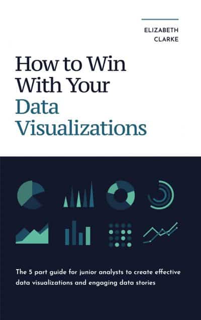
How to Win with Your Data Visualizations uncovers the fundamentals of what makes a winning data story and has laid them out in 5 easy-to-understand parts you can immediately apply to your next chart and presentation to see a winning data story unfold. In this book, you will discover
- the foundation of any great data story
- how to select the proper chart to represent the data effectively
- design secrets to keep your audience engaged, and their attention exactly where you want it
- some crucial things to know before you even start compiling your presentation
- the proven most effective way to explain a chart
- a winning presentation technique for success
Whether you’re a new data, business, or financial analyst or just looking to enhance your data storytelling ability, this book will be your guide to crafting winning data stories, creating better visuals, captivating your audience, enhancing your data analytics skills, and driving the necessary change needed to leave an impactful impression.
For about the price of your weekly morning coffee, you can make a difference with your next presentation and be ahead of the curve in what could potentially be one of the most important decades for data.


Comments